Case study MacroVibe Refinement
Genre is a system for selling, not for listening.
A community experiment in sorting music by feel, and what it took to build.
I’ve argued for years that genre is the wrong way to organize music. Genre is a good system for selling records and stocking shelves. That doesn’t translate to a good listening experience.
In the early days of Audius I initially advocated the (extreme) position that we abandon genre as a classification system. The team pushed back on this idea, correctly so. Back in 2018 machine learning to classify music by feel wasn’t available at a reasonable cost, and despite its flaws, artists expect to select a genre when uploading a track. We ultimately kept genre. The music industry defaults won.
MacroVibe Refinement is the extreme version of the argument I was making at Audius. No machine learning. No automatic classification. Just an interface that asks a crowd of humans to sort music by feel, using texture words that don’t communicate much on their own. It tests the part of the argument that the platform constraints made impossible to test inside the product.
This was a personal project, not work. Audius later amplified it on social media as a unique example of the API. Most experiences built on top of the Audius API are music players. This is a curation experiment, which felt like a much more interesting use case to me.
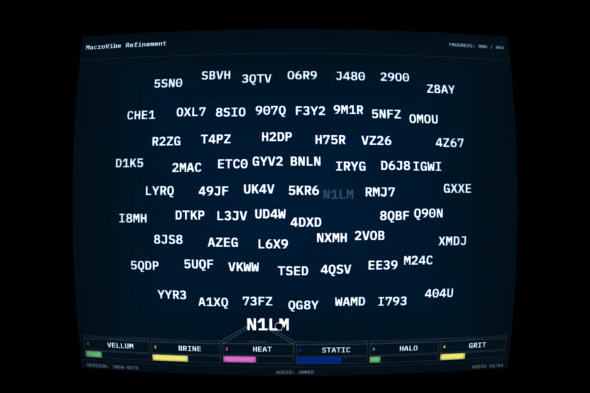
The interface
The interface is inspired by Macro Data Refinement from the Apple TV show Severance, with one core difference. The workers in the show sort numbers by feel. Outside the logic of the show, that doesn’t make sense. Numbers don’t have a feel. Music does.
Sixty-four cells float on a grid. Each one is represented by a random four-character code. Hovering a cell plays a portion of a track from Audius. No artist name. No track title. Only the audio. Six bins sit at the bottom: Grit, Halo, Static, Heat, Brine, Vellum. Texture words. You listen, you feel something, you drop the song where it feels right.
Abstracting the music from the metadata was a core design principle. The metadata would otherwise influence placement. Strip that all away and the only thing left is the audio. That’s the version of “sorting by feel” the experiment actually wants to test.
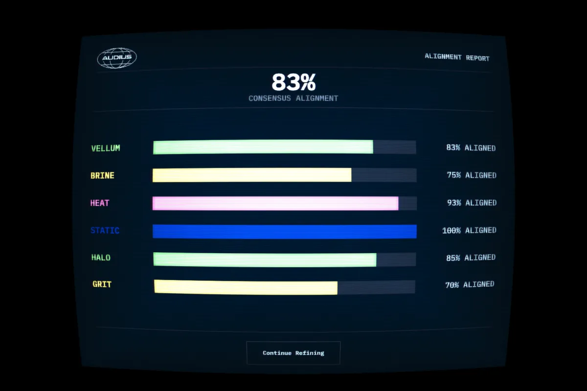
When you place all sixty-four cells, the session ends with an Alignment Report. Per-bin bars show how close your choices were to the crowd consensus. It’s deliberately simple. There’s nothing to drill into. The point is the framing, not the data: you are sorting music collaboratively with the community. Bounded sessions instead of infinite scroll make the interaction feel intentional, like a file you process and close.
How it was built
I built the bulk of this project in a weekend, with a long tail of fixes and tweaks since. Solo, with AI-assisted development. That includes the React frontend, the Supabase backend, the WebGL post-process shader, the physics simulation, the custom audio engine, and the GitHub Actions sync. None of which I’d describe myself as a specialist in.
The interface is doing more than it looks like it’s doing.
The grid is a real physics simulation. Each sorted song is a particle with a home position, a spring, a sinusoidal orbit, a flow field, particle-to-particle repulsion, and a soft scatter away from the cursor. The slot positions also wobble deterministically so the grid never looks like a spreadsheet. Without the sim, the grid would feel like a list. With it, it feels alive.
The screen runs through a WebGL post-process shader. Scanlines, bloom, chromatic aberration, barrel distortion, vignette, flicker, color grading. CSS filters can’t do this kind of work without falling apart at scale. WebGL wasn’t my first solution. I tried lighter approaches at first but they didn’t hold up or capture the aesthetic I was hoping to achieve. The hard part once I’d committed to WebGL was getting touch targets to line up with the visually distorted cursor.
The audio engine is the part I’m most proud of. Track intros are often quiet or similar, so if playback restarted every time you hover, it would feel like a bunch of repeating clips. All sixty-four tracks appear to be playing in the background from the moment the session opens. A single clock runs in the background and every track’s playback aligns to it. This creates the illusion that hovering a cell doesn’t start the track. It tunes you in to wherever the track currently is. Come back to a cell later in the session and you’re catching the song at that point in the loop, not jumping back to the start.
Pick up a cell and the music keeps playing while you drag it into the bin it belongs in. The music only stops on decisive action. Moving between cells triggers a brief crossfade between the outgoing and incoming track. Without aggressive cleanup, fast cursor movement would leave multiple songs playing at once.
The results
A GitHub Action aggregates the results and syncs them to real playlists on a dedicated Audius account every twelve hours. Each track lives in whichever bin has the most votes.
What surprised me was the through-line in each playlist. There’s no agreement between users about what fits where. One person’s Grit is another’s Halo. But the aggregate produces playlists with their own consistent feel. Grit does sound like grit. Vellum does sound like vellum.
Genre is a sales category. Feel isn’t a clean replacement at the individual level. But a crowd, sorting by feel, in the dark, produces playlists that feel coherent.